
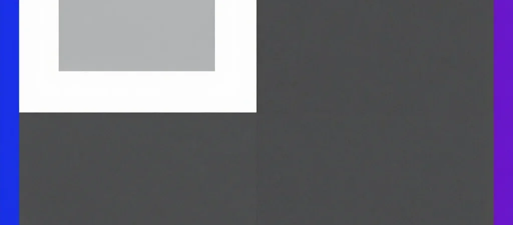
Draw two identical gray squares, then place one on a white page and the other on a charcoal page. At a glance, one may look lighter than its twin. The squares have not changed; the surrounding colors are nudging your impression.
The background changes the view
This kind of contrast illusion is easiest to notice when the gray patches are the same size and truly the same shade. Against white, gray can appear darker; against charcoal, that same gray can seem lighter. Your first impression is responding to the whole arrangement, not just the patch.
Try it with paper, colored pencils, or a simple drawing app. Make one gray square and duplicate it rather than trying to match the color by eye. Put the copies on very light and very dark backgrounds, then ask someone nearby which patch looks lighter.
A quick way to check
Cover the backgrounds so only the two gray squares remain in view. Their apparent difference should shrink; if the squares still look unlike each other, check that they really are copies of the same shade. On a screen, nearby colors, brightness settings, and reflections can all make a comparison harder.
The fun is not in catching your eyes being “wrong.” It is in noticing how much context contributes to what you see. Change the background, compare again, and you have a tiny look-again challenge ready to share.